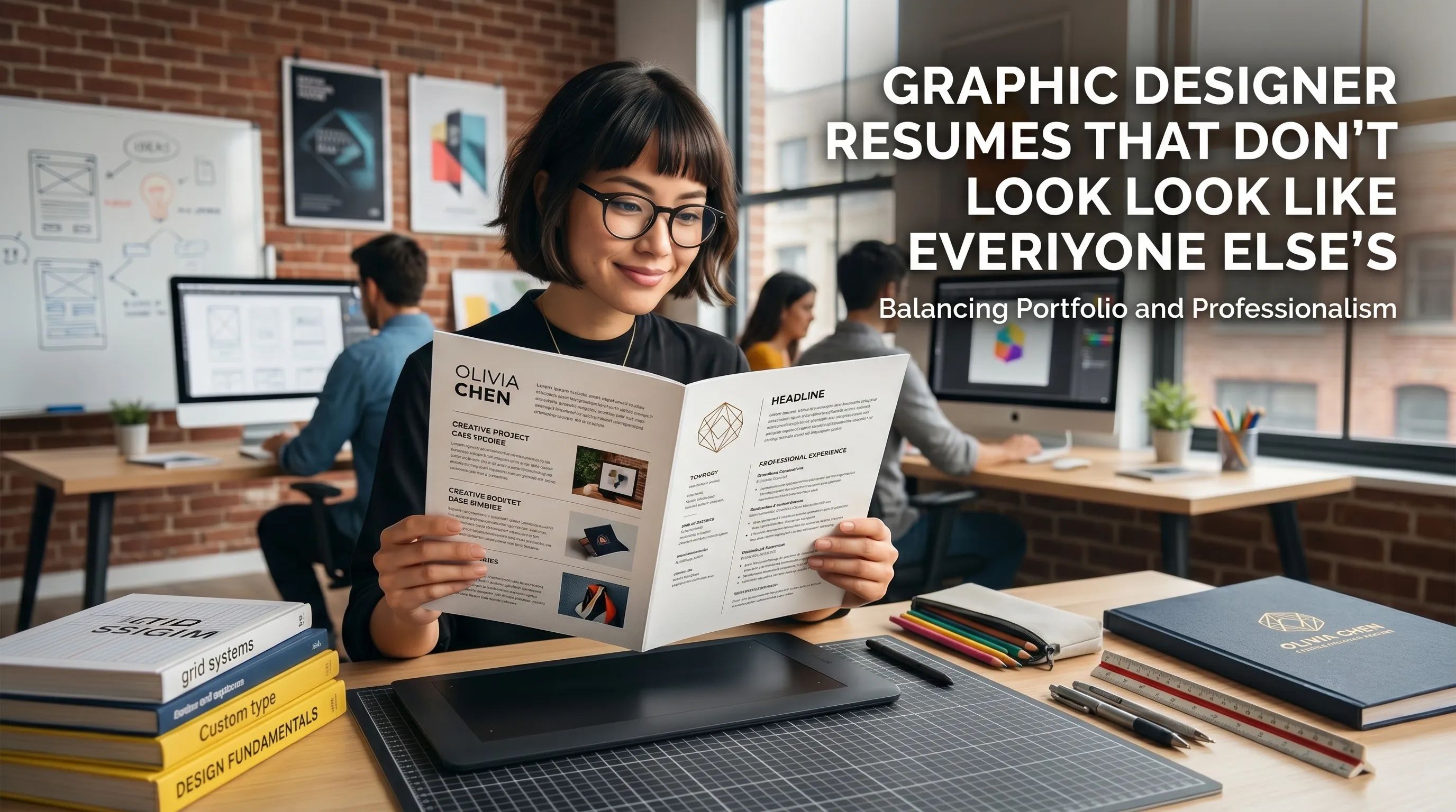
Graphic Designer Resumes That Stand Out (Without Looking Unprofessional)
It gives the hiring team a fast reading path:
name, role, niche, outcomes, and where to see the work next.
How creative vs professional your resume should look
There's a spectrum between "plain corporate Word template" and "poster for a design conference." The sweet spot depends on the role and the company, but common guidance looks like this:
- Agencies, studios, in‑house brand teams: you can be more expressive with typography, color, and layout—as long as readability and hierarchy are rock‑solid.
- Corporate or highly regulated environments: lean more toward a restrained layout; show your creative range in the portfolio and case studies.
LinkedIn and resume resources consistently say the resume must still feel professional: enough white space, consistent alignment, and clear hierarchy, with creativity used to enhance—not replace—structure.
Choosing the right level of creativity
| Target environment | Resume style that usually fits |
|---|---|
| Agency or studio | Slightly more expressive typography and layout, but still highly readable |
| In-house brand team | Polished and branded, with restraint and strong hierarchy |
| Corporate or regulated company | Cleaner, more conservative layout with subtle design touches |
| ATS-heavy application flow | Text-first, highly readable version with plain structure |
If humans will review it directly, subtle personality can help.
If systems or non-designers see it first, clarity should win every time.
Visual hierarchy: your quiet differentiator
Art directors reviewing designer resumes pay particular attention to how you handle hierarchy and spacing. They're looking for:
- A clear reading path from name → title → summary → experience, using size, weight, and spacing.
- Careful use of bold, italics, and color to emphasize just a few key elements, not everything.
- Aligned grids and consistent spacing between sections and bullets.
One tip common in graphic design communities: "Design your resume as if the hiring team is the client." That means you respect their constraints, use familiar patterns, and don't let a clever layout get in the way of the brief—quickly understanding your experience.
Content: turning design work into business outcomes
Many designers get stuck listing responsibilities ("designed posters, banners, social posts") without explaining impact. Hiring managers and recruiters repeatedly say they look for evidence—numbers, outcomes, or at least concrete results.
Example: weak vs strong bullets
| Version | Bullet | Why the strong version wins |
|---|---|---|
| Weak | "Designed social media graphics for campaigns." | No scale, no results, every junior designer can say this. |
| Strong | "Designed a series of social media visuals for a three‑week campaign, helping increase engagement by 40% across Instagram and TikTok." | Shows scope, timeframe, channels, and a measurable outcome. |
| Weak | "Responsible for branding tasks." | Vague, sounds passive and generic. |
| Strong | "Led visual refresh of the brand's pitch deck and sales collateral, improving win‑rate on proposals from 18% to 26% over two quarters." | Positions you as proactive and commercially aware. |
Guides for creative resumes emphasize coupling creative skills with business impact—click‑through rates, sign‑ups, sales, fundraising, or internal adoption—whenever you legitimately have the numbers.
More ways to add outcome language
| Weak phrasing | Stronger phrasing |
|---|---|
| Designed event assets | Designed campaign assets that supported turnout or ticket sales |
| Created presentations | Redesigned sales deck that improved clarity and proposal performance |
| Worked on brand updates | Led brand refresh that improved consistency across key materials |
| Made social posts | Built social asset series tied to engagement growth |
- scale,
- timeframe,
- audience,
- channel,
- or measurable result.
How to feature your portfolio so no one misses it
One of the most painful things hiring managers describe is having to hunt for your portfolio link. In practice, links end up scattered: once in a tiny header, once in body text, maybe hidden in a cover letter footer.
A UX‑oriented recruiter wrote that the fastest way to ensure your work gets seen is to repeat your portfolio link in predictable places: header, contact section, and even in a short "Selected work" area.
Practical placement ideas:
- In the header:
hamedgolchin.com • Behance /hamed • Dribbble /hamed - In a "Selected work" subsection under experience:
- "Rebrand for XYZ – see case study: hamedgolchin.com/xyz‑rebrand"
Portfolio and career resources also suggest keeping the URL readable and human (your name or studio) instead of an obscure string full of numbers.
One resume, multiple "skins"
A lot of modern advice for graphic designers is to maintain two versions of your resume:
- Clean, text‑first version for online applications and any system that might parse your document.
- Visually richer version for sending directly to creative directors, bringing to portfolio reviews, or attaching in email once you're already talking.
Robert Half, for example, recommends always having a text‑based resume ready for digital submissions, then using a more designed version when you know humans will be printing or viewing it directly. Hybrid‑resume articles for designers echo this: blend a minimalist core with subtle brand touches, and keep the wild experiments for your site.
Text-first vs designed version
| Version | Best use case | Key trait |
|---|---|---|
| Clean, text-first resume | Online applications, ATS, job boards | Maximum clarity and compatibility |
| Designed resume | Direct outreach, interviews, portfolio reviews | More visual personality without losing readability |
The content, achievements, and positioning should stay consistent.
Only the visual treatment changes.
Examples of subtle differentiation (that still feel professional)
You do not need a diagonal layout or neon gradients to look different. Career and portfolio guides point to quieter ways to stand out:
- Type pairing: Use one workhorse sans‑serif and one characterful serif for headings, with consistent sizing and spacing.
- Micro‑copy: Rename sections slightly ("Selected Work" instead of "Projects," "Tools & Methods" instead of "Skills") without losing clarity.
- System thinking: Use a consistent spacing system (for example, 4‑pt multiples) and stick to it everywhere.
- Case‑study teasers: Under each role, add a one‑line pointer to a key project: "Brand refresh for ABC – see case study."
Design blogs and portfolio courses often say your ability to be restrained is, in itself, a signal of seniority and taste.
Final test: would you hire yourself off this resume?
Before you send anything, run three checks that hiring managers and portfolio coaches commonly recommend:
-
The non‑designer test
- Show it to someone outside design: can they tell, in 30 seconds, what you do, what you're good at, and where to click for your work? -
The print test
- Print it in black and white. Does it still read clearly, with hierarchy and enough contrast? -
The scan test
- Scroll through in five seconds. Do your name, title, top skills, recent role, and portfolio URL pop out immediately?
If those three tests are solid, you're in the sweet spot: your resume looks like it belongs to a professional designer, doesn't vanish into the sea of templates, and does the only real job that matters—getting someone curious enough to open your portfolio and start a conversation.
FAQ
What is the difference between a graphic designer resume and portfolio?
A resume is for quick scanning and qualification, while a portfolio shows depth, process, and creative quality. The resume should make someone want to open the portfolio.
Should a graphic designer resume be highly creative?
It can show personality, but readability and hierarchy still come first. The right level of creativity depends on the role, company, and whether the resume will be reviewed by humans or systems first.
Where should I place my portfolio link on a designer resume?
Put it prominently in the header and make it easy to read. You can also repeat it in a selected work section so hiring teams do not have to hunt for it.
Do graphic designers need two resume versions?
Often, yes. A clean text-first version works better for online applications and ATS systems, while a more designed version can work well for direct outreach or portfolio reviews.
What makes a designer resume look professional instead of over-designed?
Clear hierarchy, readable typography, strong spacing, visible links, and outcome-focused content. Creativity should support the reading experience, not compete with it.